 Pawan Kumar
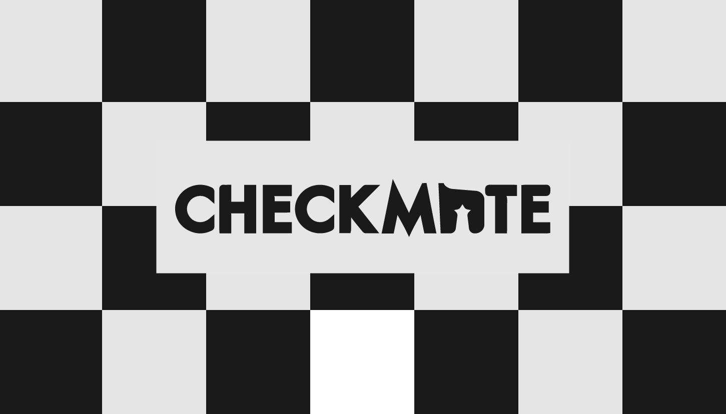
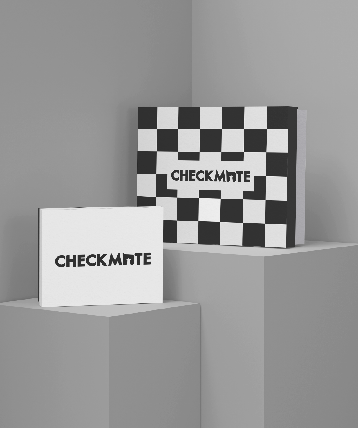
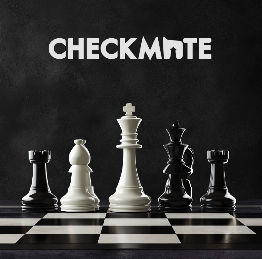
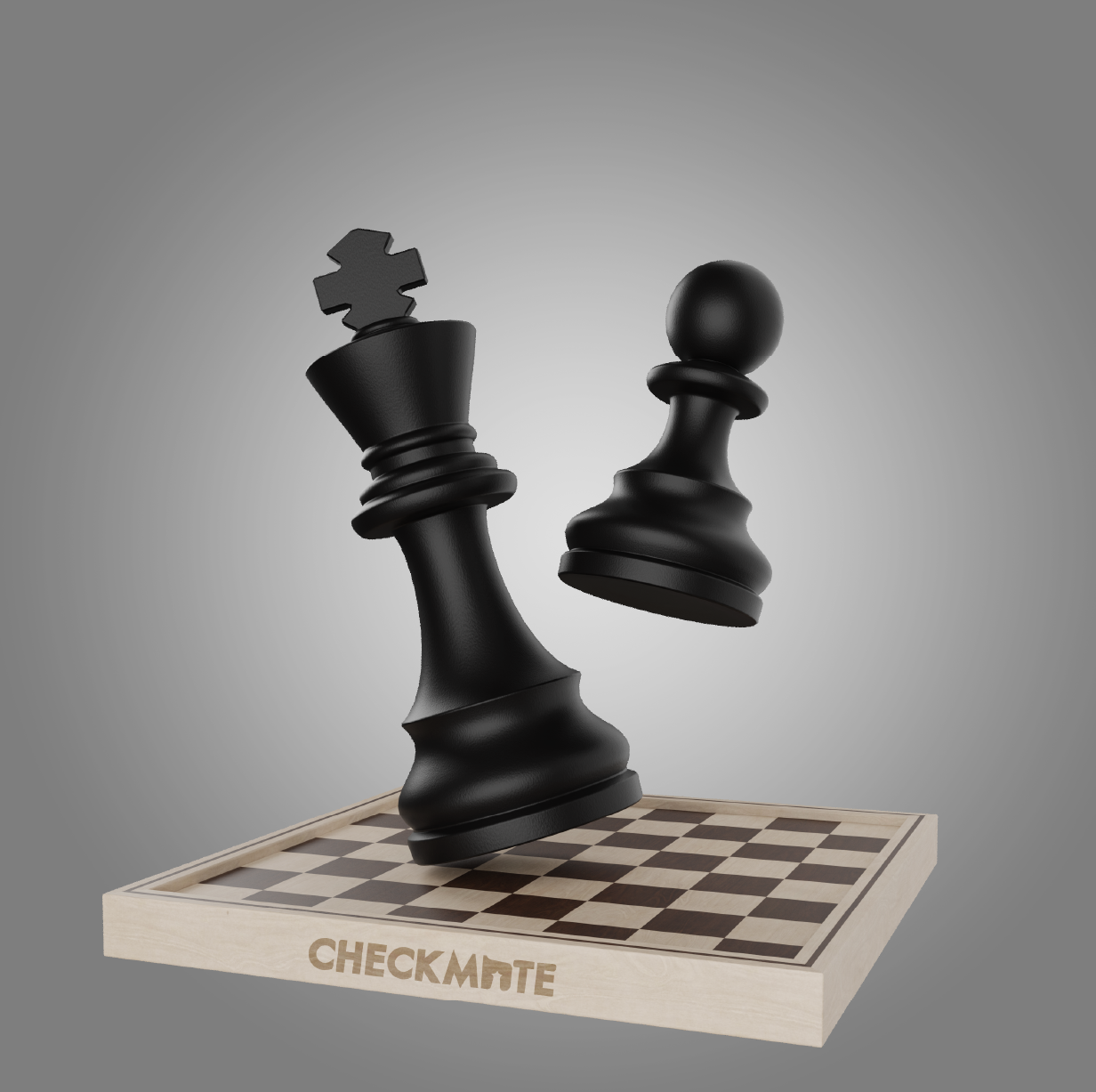
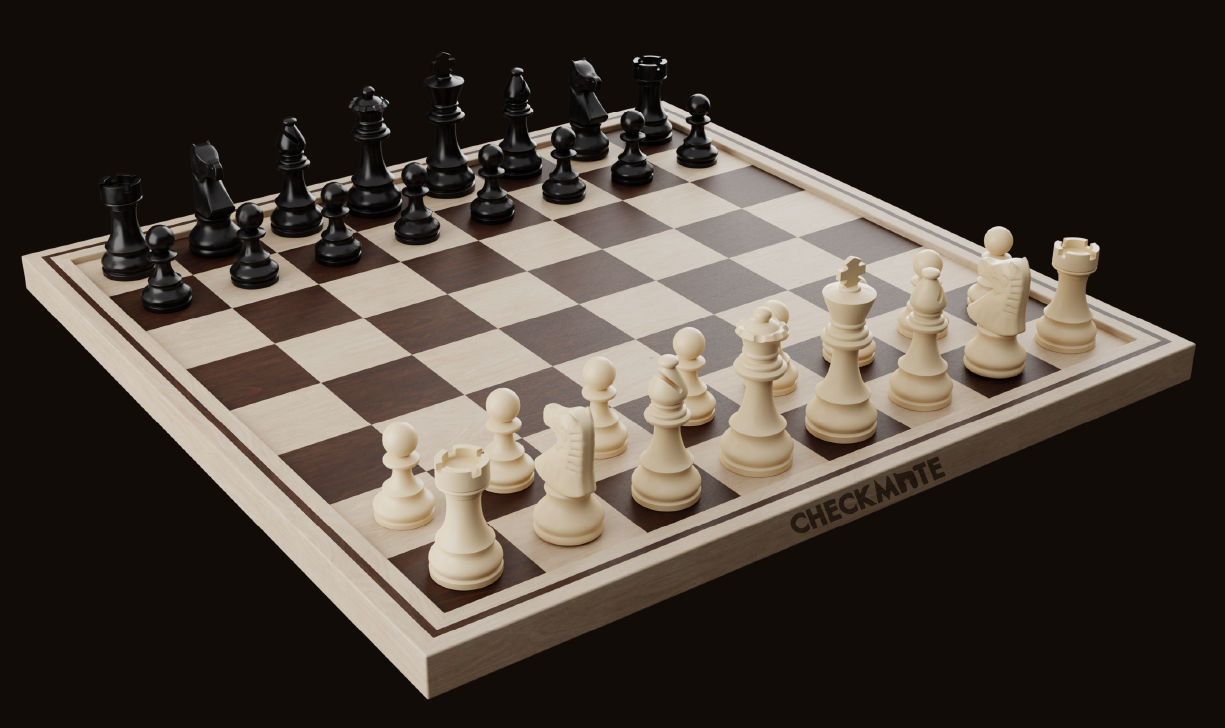
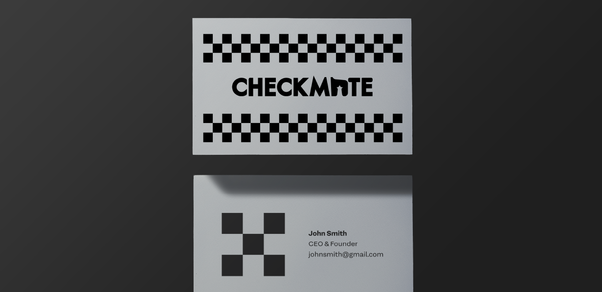
The Checkmate logo combines bold typography with clever symbolism. The standout element lies in the integration of a knight chess piece into the letter "A", replacing it with a stylized form that captures both the intelligence and tradition of the game. This minimalist approach reflects the brand’s dedication to craftsmanship, strategy, and heritage.
The use of strong, clean letterforms enhances legibility while conveying a sense of strength and precision — echoing the values embedded in every handcrafted board Checkmate produces. The slightly softened grayscale color palette keeps the logo versatile for use on premium packaging, wood-burned branding, or digital media.


Before creating the visual identity, I studied the aesthetics of high-end chess boards and brands within the luxury strategy game space. Key takeaways that shaped the brand identity:

Beautiful design has the power to captivate audiences